As an online business owner, when is it time to redesign your website? Well, that’s what this article talks about. A website is one of the most important marketing assets a business could own in today’s digital age. For many businesses, the channel with which they reach each of their targeted customers is through a functional business website. Simply, your website is an online representation of your business. However, you can be reducing your chances of connecting with your targeted audience when your website is not well-designed and optimized. So, when is it time to redesign your website?
Statistics show that 75% of consumers determine a company’s credibility based on its website design. This simply means you’re at risk of losing out on prospective customers and business opportunities if your website needs a redesign. This article gives a comprehensive answer to your question “when is it time to redesign your website?”
If you’re reading this article, chances are you already have a website for your business. If you ever wondered if you are on the right track with your website or why redesign your website? This is for you. This article has explained in detail what redesigning your website is all about, when you should redesign your website, and the top 10 signs your website needs a redesign. This article answers your question to “When is it time to redesign your website?

What redesigning your website is all about?
Before we get right into it, there are various reasons for redesigning your website but the top of the list is an obvious problem and a proposed solution with an action plan. However, before putting this action plan for a website redesign in place, you have to understand the purpose of redesigning. That is, what redesigning is all about?
Website redesign has to do with changing elements of your website like content, structure; visuals, and code to enable the audience to interact better with your website. Having fully understood that your website is a business tool that is essential to the success of your brand, its design becomes more important than ever. Redesigning your website will make a great impact on your customers and their experience with your website.
When should you redesign your website?
When is it time to redesign your website? You might think, why redesign a website in the first place? These are signs your website needs a redesign:
Your website needs redesign if it doesn’t capture your audience and show year-over-year growth, Your website also needs a redesign if it doesn’t reflect the services your business has to offer. In addition, if prospective customers are unable to find what they are looking for or if your website takes too long to come up.
Amongst other things, if your website is not user-friendly, easy to navigate, or well designed; it is time for a website redesign. Although, the thought of redesigning your website all over again can be exhausting if you think of the hours of creativity it took to design it in the first place. However, redesigning your website will increase the overall performance of your website.
10 Pointers that show it is time for a Website Redesign
1. When your Website isn’t Visually Appealing:
A study by Darek Halpern has shown that 94% of website users leave a website because of its bad appearance. Your website design is as important as every other thing on your website. First impression matters. Your website design is usually the first thing that welcomes a visitor when they visit your website. This happens even before they get to read its content.
If your website design is ugly or visually outdated, then it is one of the signs your website needs a redesign. Ugly color combination, boring designs, and graphics, poor text to image ratio, excessive pop-up advert, bad website layout, font size are all signs your website needs a redesign. A good website should have an appealing effect on its users.
As a brand owner, a high-quality UI/UX website design is one of the best strategies to relate the brand image to your website visitors especially those visiting for the first time. At the same time, you stand a chance to earn the trust of your visitors. If you have this in place, you can now move forward to pointer #2

2. When your Website doesn’t Rank well on Search Engines Result Pages:
Again, why redesign a website? – You need to redesign your website when it doesn’t rank well on search engine result pages. Ranking high on SERPs especially Google is often the goal of any website. If not, why would go through the stress of setting up a website if your chance of being found on SERPs is very low? 95% of Google searchers don’t go beyond the third page. So, it’s either you rank high and get found by your target customers or you don’t exist at all.
Hence, if this pointer describes the state of your website currently, then, you don’t need to ask “when is it time to redesign your website”. Now is the time to start planning how to redesign your website. This takes us to pointer #3.
3. When your Website contents and keywords are outdated:
Another reason why you need to redesign your website is when your website contents and keywords are outdated. Keywords are the words that help your potential customers find your business through organic search. When your website has no keywords or is stuffed with the wrong keyword, you need to revisit your content.
A study carried out by Hubspot Academy revealed that websites which upload up to 16 fresh content pages per month are three times more likely to attract traffic. They also stand a better chance of increasing their exposure on search pages than those who do not.
To this end, a good website design or layout should support constant updates such as the addition of new relevant content laced with relevant updated keywords. An updated website with a good design should also permit easy and quick editing of existing posts, uploading of new images even by an inexperienced person.
However, if your website is the opposite of the above description, it is sure a good time to redesign your website

4. When your Website has a high Bounce rate and Low Conversion rate
When is it time to redesign your website? when your website has a high bounce rate. Bounce rate is the number of people expressed in percentage that left your website after viewing a page without taking any action. It is the percentage of people who spent little time on your site and never returned.
A website with a bounce rate within 26 to 40% is great. One with 41-55% is on the average while 56-70% bounce rate is higher than average. A bounce rate above 70% is bad for any website that will do well on SERPs.
Bounce rate can result from difficulty in navigating through your website or a website that doesn’t provide the accurate information needed by a searcher.
Among the many reasons a website is created is to provide accurate information to a searcher. It is also to make a product or service available to a potential customer. Providing accurate information about a topic gets visitors subscribing to receive your content based on the provided subscription. In the same way, an accurate and convincing review and testimonial will make a lead take the next step in buying your product or service such as clicking the call-to-action button or stopping at your store.
In addition, the longer a visitor stays on your website shows they found something useful on your website. Thus, the more they are likely to convert to sales. Even if a visitor does not convert, they are likely to return at a later date.
On the contrary, if your website design is difficult to navigate or your website doesn’t provide accurate information to your visitors (as explained in pointer #2), they automatically bounce off your website in no time. Because your leads find it difficult to navigate your website, it prevents them from taking necessary action towards purchasing your product or service (low conversion rate).
If this is what you’re currently facing with your website, it is one of the signs your website needs a redesign. Now, let’s dive into pointer #5 here.
5. When your Website is difficult to navigate:
Why redesign a website? A website difficult to navigate shows your website needs a redesign. If your website is difficult to navigate, it becomes difficult for users and search engines to find you. Here is how it works:
When a person comes to your website looking for information, a product, or a page, they want to get it as fast as possible. Otherwise, they move back to the search engine pages and click on the next best available option- your competitor. Chances are they might never return to your website if they are experienced difficulty accessing it. Certain pages on your website such as the “About Us”, what” product or service” you offer”, and the ‘Contact us” should be easy to find. If they aren’t, then your website needs a redesign.
The same thing applies to Google. One Google survey showed that 61% of users are unlikely to return to a website if they had trouble accessing it. It relies on the structure and information present on a website to determine the relevancy of your web content and how it fits into the purpose of the website. When your site is difficult to navigate, Google finds it difficult to crawl your site. This makes it difficult for your website to show up in relevant search queries.
6. When your Website has a Slow Load Time:
When your website has a slow load time, certainly it’s time to do something about it. Do you know it takes about 8 seconds for a user to form his opinion about your website? Another statistic showed many visitors abandon websites that take more than 3 seconds to load. This means you have split seconds to determine the fate of your website with every visitor.
If your website page loads slowly, a user will simply click on the back button, and off he goes to your competitor’s website – certainly, this isn’t something you want to happen. Hence, it shows your website needs a redesign.
A slow website can result from large page sizes, bad codes, and non-optimized images. This automatically affects your overall website performance, SEO, and conversion rate. It is your job to ensure you take advantage of these split seconds to get a visitor never to visit your competitor’s website.
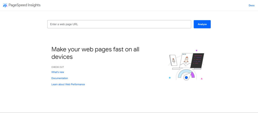
If you’re not sure of your load time there is a free tool on Google you can use to check the speed of your website. If your result comes out bad, restrategize, or else your competitor gets all the traffic you have always desired. At Iconic Digital World World, we can help you achieve your personal and business goals on your website with our website redesign services.

7. Lack of Mobile-Friendliness:
One major reason why redesigning your website becomes a necessity is when your website is not optimized for mobile functions. Nowadays, having a mobile-friendly website is no longer an option, but a requirement. People feed on information anytime and anywhere and the best available fast option is usually their smartphones. A higher percentage of people access the internet through their mobile devices when compared to through their PC or tablets. Mobile-generated traffic is also becoming increasingly high. In addition, an average person spends about 5 hours on their smartphone daily.
A website that is not mobile-friendly results in a bad user experience. Moreover, if your website isn’t mobile-friendly, you risk losing your customer to your competitor. When this happens, it is one of the signs your website needs a redesign. Statistics showed that 57% of website users won’t recommend a business with a bad website design on mobile phones.
If your website is still not mobile-friendly in this 21st century, wasting more time can be detrimental to the success of your business. Go ahead to redesign your website. If you need help from a professional, waste no time in getting one.
8. When your Website lacks On-page Optimization
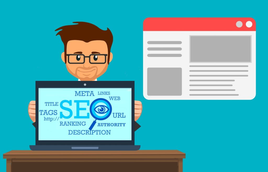
It is time to redesign your website when your website lacks on-page optimization. For your website to rank high on algorithms search engine result pages, you must perform an on-page SEO for each page of your website. What this on-page optimization means is each page should have a unique title tag that describes a page’s main idea or focus. Title tags are used by search engines to create listings.
Other on-page SEO include -:
- Unique title tags
- Unique meta-description
- Optimized images
- Page URLs with relevant keywords
- One H1 tag on each web.
- Links between pages.

9. When your Website doesn’t Reflect your Brand and its marketing Goal
Another reason why redesigning a website is important is when your website doesn’t reflect your brand and its marketing goals. On the first visit, a user should be able to decipher the type of goods and services or products you offer on your website. Your website should easily reflect your marketing goals this is not the case for you and your business website, it is time to redesign your website.
Likewise, when you feature a new improvement or addition to your business, it should also be added to your website. Don’t leave your potential lead guessing what your website is all about after staying on your page for minutes. Rather make them understand clearly and quickly how you can solve their problems. Starting with your homepage. Your website is your biggest salesperson. It is always on board when you are there and when you’re not there. So, let it speak for you.
10. When your Website isn’t Secured
One last pointer that shows your website needs a redesign is when it isn’t secured. A secured website uses the Hypertext Transfer Protocol Secure (HTTPS). HTTPS is an encrypted network communication protocol that collects or gathers data entered into a website. This is usually done to prevent unauthorized persons from having access to other users’ information.
With the increase in online cybercrimes and frauds, the last thing you would want to do is to scare users off your website. Your users want to know and be sure that their private information will not be leaked or stolen. One best way to earn the trust of your visitors is when your site is secured. This way they can keep visiting your website.
HTTPS secured websites shows as a secure padlock icon on the Google Chrome browser. One way to know is the ‘S’ in HTTPS shows that a website is secured. The absence of ‘S’ shows a website is not secured.

Final Thoughts:
From the list of the website conditions above, is it time to redesign your website? Surely, if your website is facing any of the conditions listed above, then it’s time for a website redesign.
Not sure if your website needs a redesign? contacting professional website designers can help you out. Iconic Digital World can help you perform a free website evaluation that will help analyze it. With this free tool, you’d realize the condition of your website and what needs to be done.
