Case Study:
Great Lakes Dental Care
Website Revamp
Before
- Cluttered, dark layout
- Inconsistent color scheme
- Unclear, hidden CTAs
- Unprofessional appointment form
- Lacked trust & clarity

After
- Clean, bright design
- Trustworthy, polished look
- Clear, bold CTAs
- Prominent request buttons
- Relevant, high-quality images
- Services visually explained
- Improved user experience

- Vague, slightly confusing messaging
- Use Case-overload that overwhelms the visitor
- Never explains what the product does or how it works
- Cluttered, dark layout
- Inconsistent color scheme
- Unclear, hidden CTAs
- Unprofessional appointment form
- Lacked trust & clarity

Before
- Vague, slightly confusing messaging
- Explains exactly how the product works
- Explains the exact problem being solved
- Clean, bright design
- Trustworthy, polished look
- Clear, bold CTAs
- Prominent request buttons
- Relevant, high-quality images
- Services visually explained
- Improved user experience

After
Project Details
Purpose: A website design for dental care services
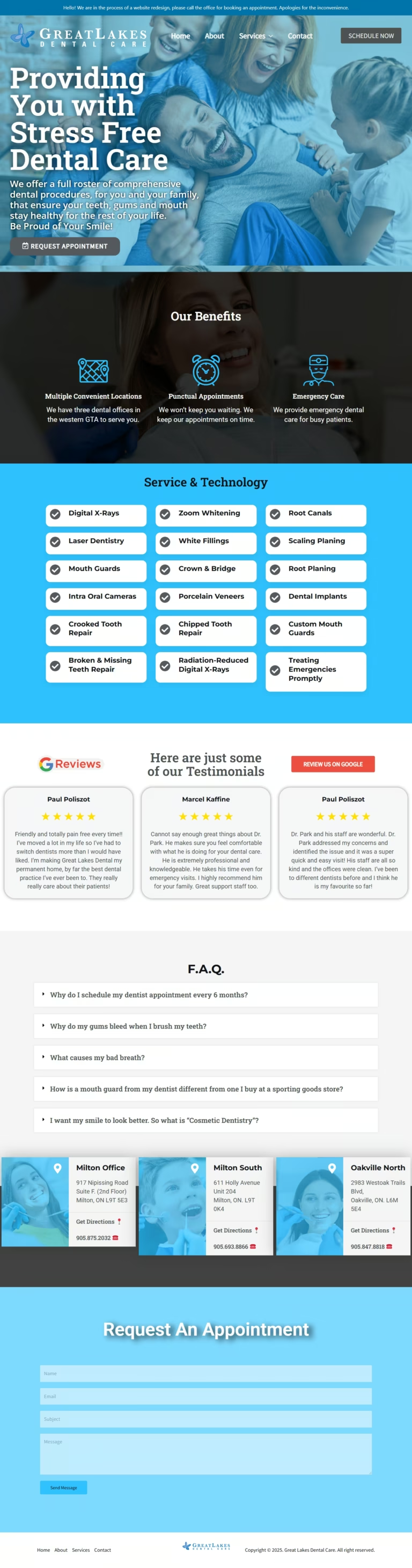
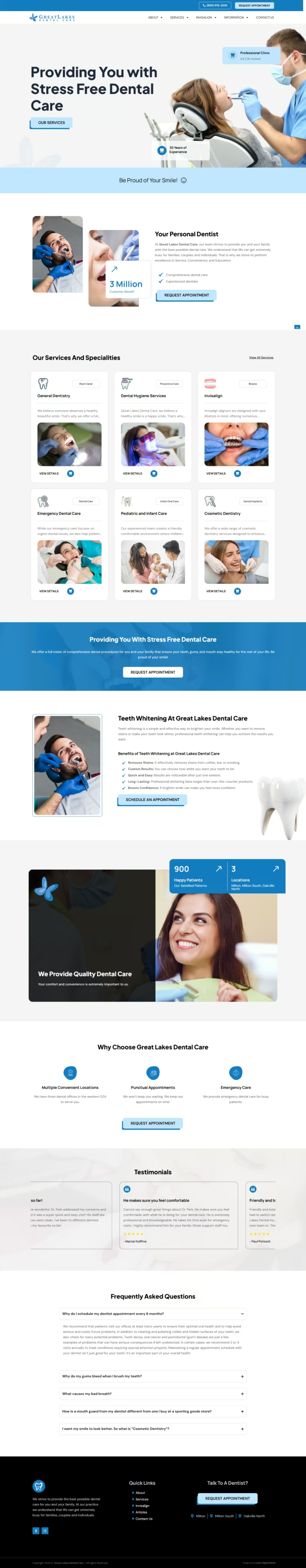
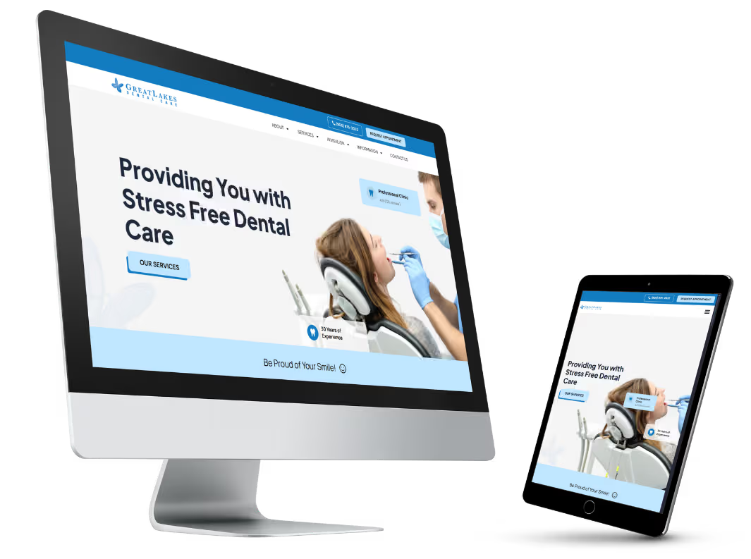
Challenge: Great Lakes Dental Care Website Design: A clean, fast, and mobile-friendly website that emphasizes our services, highlights what makes us different, and is easy to navigate for booking an appointment.
Platform: WordPress
Color: Blue
Language: English
Location: Canada
Location: Canada

Other Deliverables
- Lorem ipsum dolor
- Lorem ipsum dolor
- Lorem ipsum dolor
- Lorem ipsum dolor
- Lorem ipsum dolor
- Lorem ipsum dolor

We can make it happen! You don’t have to miss amazing opportunities anymore…just because your website is poorly designed!